Image Hotspot Design: Placement, Labels, and Feedback
Design image hotspots that are easy to find, understand, and use. Learn placement, marker styles, labels, feedback, mobile checks, and accessibility.
An image hotspot is useful only when a learner can tell where to act, what the action means, and what to do with the result. A marker can be technically clickable and still fail as instruction. It may cover the evidence, blend into the picture, open a vague label, or ask for a precision the image cannot support.
This guide gives you a practical design method for clickable image hotspots. It covers points and regions, exact placement, marker treatments, labels, feedback, mobile scaling, and accessibility. If you need the creation steps first, start with the step-by-step interactive image guide. If you need ideas for a lesson, browse the interactive image examples.
Hotspot anatomy
The marker should reveal evidence, not hide it
- The largest marker covers the evidence.
- Labels describe the interface, not the learner action.
- Competing cues have no clear order.
- The evidence stays visible inside a precise focus area.
- The label starts with a clear verb and names the target.
- One visual cue owns the next action.
First decide what the click should do
Do not begin with marker color. Begin with the learner action. Complete this sentence: When the learner selects this place, they should _____. A clear verb usually points to the right interaction.
- Explain: reveal a short information hotspot attached to visible evidence.
- Find: ask the learner to select the correct point or region.
- Identify: match a name to a visible part.
- Compare: inspect two regions using the same criteria.
- Sequence: select image regions in an ordered process.
- Inspect more closely: enter a deeper Narrative Tapestry scene.
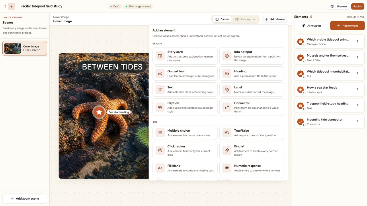
A hotspot should not exist merely because an object is visible. It should help the learner notice evidence, make a decision, or build a useful mental model. The distinction matters because interaction supports learning when the action carries meaning, not when it simply adds more clicking.
Choose a point or a region
The selectable shape should match the thing you are teaching. A point says, “this location.” A region says, “this bounded area.” Choose based on evidence, not convenience.
Use a point
Best for one named object, a precise anchor, or an explanation that belongs at a specific place.
Examples
A valve handle, a person in a photograph, a chart anomaly, or a menu control in a screenshot.
Use a region
Best when the answer is an area, the boundary matters, or the learner should not need pixel-level precision.
Examples
A lung lobe, a country on a map, a machine hazard zone, or every damaged tile in an inspection photo.
Do not make a tiny point carry an area-based question. If the learner can reasonably select anywhere inside the object, draw a forgiving region around it. Conversely, do not highlight half the image when the lesson depends on one exact feature.
Put the trigger on the evidence
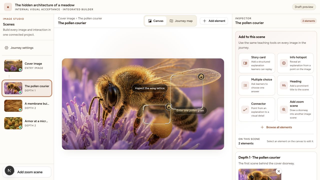
Placement should be evidence-aligned. If a label says “Inspect the wing lattice,” the focus frame should sit on the visible wing veins, not on the animal's body and not on empty background. The learner should be able to connect the instruction and the evidence without guessing.
- Identify the smallest complete visual unit that supports your claim.
- Place the marker at its edge or center, depending on which position hides less information.
- Resize a region so its boundary follows the meaningful subject.
- Open the activity and confirm that the explanation refers to what is actually visible at that location.
This is especially important in maps, technical diagrams, and inspection photographs. A few pixels can change the country, component, tissue, or defect being identified. In uncertain source material, write a less precise claim rather than pretending the image provides stronger evidence than it does.
Keep the subject visible
Hotspots sit on top of an image, so every control spends some of the image's visual space. Treat that space as scarce. The most important subject should remain readable before, during, and after selection.
- Move a point just beside a small feature when the link stays clear.
- Use a lighter marker treatment over detailed evidence.
- Place a label in open background rather than across the subject.
- Use Edge when the trigger itself would cover a delicate feature.
- Break a crowded picture into a guided tour or deeper scene rather than stacking more controls.
Do not solve occlusion by making every marker faint. A trigger that cannot be found is not better than one that covers the image. Adjust the position, treatment, size, and label together until both the evidence and the action are clear.
Choose the marker treatment
Interakly gives you five marker treatments: Classic, Prism, Focus, Orbit, and Edge. Ordinary activities start with Classic, labeled Legacy in the editor. Narrative Tapestry doorways start with Focus. Defaults give you a dependable first draft, but the local image may call for another treatment.
Marker decision matrix
Choose a treatment for the visual job
| Treatment | Visual role | Choose it when | Check before publishing |
|---|---|---|---|
| ClassicOrdinary default | Clear, familiar pin | Most ordinary information and question hotspots | Use a tint that remains visible against the local image color. |
| Prism | Light glass lens | Detailed images where a heavy solid marker would cover evidence | Check the rim against both bright and dark areas. |
| FocusTapestry default | Frames an authored region | Doorways, close inspection, and meaningful bounded areas | Draw the frame around the subject, not nearby background. |
| Orbit | Strong depth cue | A featured entry point that should suggest a closer layer | Reserve it for important moments so the cue keeps its meaning. |
| Edge | Action beside the subject | Small or delicate evidence that must stay completely visible | Keep the connection between trigger and subject unmistakable. |
After choosing the treatment, configure the rest as one system:
- Tint: choose a color that separates from the image at that exact location. Never use tint as the only way to distinguish one action from another.
- Icon: choose a symbol that supports the action. An information cue and a deeper inspection cue should not look interchangeable.
- Size: use S, M, or L according to image detail and importance. Larger is not automatically clearer if it covers the answer.
- Pulse: use motion sparingly for the first or most important action. If everything pulses, nothing has priority.
- Show label: turn it on when the icon alone cannot set a clear expectation.
- Custom label: write the action the learner is about to take, not a generic interface instruction.
The W3C guidance on use of color explains why a tint cannot be the only signal. Pair color with text, shape, icon, position, or another visible distinction.
Write labels that set expectations
A hotspot label is microcopy. Its job is to help a learner predict the result before selecting it. Strong labels usually combine a verb and a concrete target.
Keep visible labels short enough to scan. Put the fuller explanation inside the activity. When a label would merely repeat a nearby heading or story card, hide it. Redundancy can be as distracting as missing information.
Prevent overlap and visual noise
Overlap is not only a spacing problem. It is a hierarchy problem. When several labels, story cards, and markers compete in one area, the learner cannot tell which action is primary.
- Reserve space for fixed controls, story cards, headings, and doorway frames first.
- Place the primary learning action in the clearest remaining area.
- Put secondary labels above, right, below, or left according to the available background.
- Hide a redundant label, change to Edge, or split the scene if no clear position remains.
Avoid long diagonal leader lines that cross other subjects. Avoid making labels touch the image edge. Avoid placing two different actions so close that a learner can select the wrong one by accident. The WCAG target size guidance is a useful minimum reference: pointer targets generally need a 24 by 24 CSS pixel area or sufficient spacing, subject to the criterion's stated exceptions.
Write feedback that teaches
Graded image activities need more than a red or green state. Feedback should connect the learner's action to visible evidence. A useful response answers three questions:
- Was this selection correct for the stated task?
- What visible feature supports the answer?
- What should the learner notice or try next?
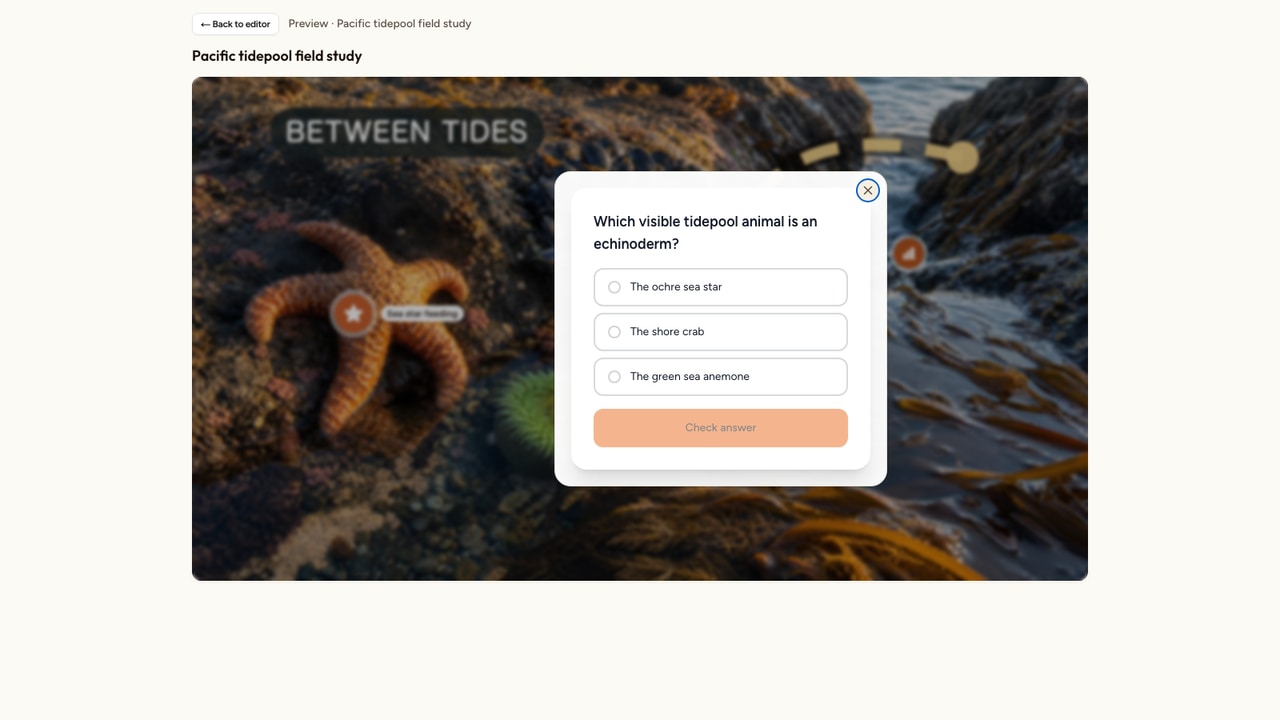
Weak feedback says, “Incorrect. Try again.” Better feedback says, “That is the outlet pipe. Look for the narrower pipe entering the pump housing from the left.” The second version gives the learner a usable distinction without simply revealing an answer disconnected from the image.
Review AI Auto-place results
Interakly AI Auto-place can create 3 to 8 information hotspots from an image. That is a useful first draft, not a finished lesson. AI can name a visible object correctly while placing the marker on the wrong edge, writing a fact that does not serve your goal, or treating similar details as separate lessons.
Confirm each object
Check that the title and explanation describe the visible subject accurately.
Move onto exact evidence
Place every marker on the feature the text asks the learner to inspect.
Remove weak stops
Delete duplicates, decorative facts, and details that do not support the learning goal.
Rewrite for the learner
Replace generic descriptions with concise explanations tied to what can be seen.
Add deliberate practice
Add click regions, labeling, comparison, sequence, or another graded activity when learners should apply the idea.
Check the scaled mobile view
On smaller screens, Interakly keeps image elements tied to the image and scales them with the canvas. The authored placement, text, marker, and spacing retain their relationship instead of being rearranged into a different lesson. That makes the desktop design decision more important, not less.
Preview at a realistic phone width and check all of the following:
- The subject remains recognizable at the smaller image size.
- Markers are visually distinct from nearby image detail.
- Labels remain inside the stage and do not cover each other.
- Region boundaries still communicate the intended answer area.
- The learner can select each target without activating a neighbor.
- Open cards and feedback stay connected to the visible evidence.
Do not enlarge every marker to compensate for a crowded source image. First remove unnecessary controls, choose clearer image detail, or split the content into scenes. For more examples of matching an interaction to visual structure, read the guide to visual learning.
Support keyboard and screen reader access
A visual interaction needs a non-pointer route. The W3C image map tutorial recommends meaningful text alternatives for the complete image and for each selectable area. Apply the same principle to modern hotspot controls.
- Write alt text that states the purpose and essential content of the base image.
- Give every hotspot a specific accessible name, such as “Inspect the pump inlet,” rather than “Button 4.”
- Make the controls reachable in a logical keyboard order that follows the lesson.
- Keep a visible focus indicator against the local image color.
- Support activation without requiring a mouse or precise gesture.
- Provide the same explanation or result to people who cannot inspect the image visually.
- Test at zoom and with a screen reader instead of assuming an accessible name is enough.
Do not make essential instructions appear only on hover. If extra content does appear on hover or focus, the W3C guidance for content on hover or focus explains that it must be dismissible, hoverable, and persistent under the conditions described there. Click or keyboard activation is usually a clearer foundation for instructional hotspots.
A practical hotspot workflow
The fastest reliable process separates learning decisions from visual styling. Use this order for a new image or when cleaning up an existing one.
Name one observable outcome
State what the learner should find, explain, distinguish, or order after using the image.
Mark the evidence
Identify the exact points and regions that support that outcome before writing cards.
Choose the action
Select an information, question, comparison, labeling, sequence, or deeper-scene activity that matches the job.
Write the smallest useful label
Use a clear verb and target, then put the fuller explanation or question inside the activity.
Choose the visual treatment
Configure treatment, tint, icon, S/M/L size, pulse, and label according to the local image.
Preview and revise
Test the full learner path on desktop and phone, then test keyboard order, focus, activation, and text alternatives.
If your source is a process drawing, system map, or labeled figure, the interactive diagram guide shows how to turn that structure into explanation and practice without making the canvas crowded.
Final quality checklist
Run this short audit before publishing. If any item fails, fix it in the image studio and preview again.
Purpose
- Every hotspot supports one named learning goal.
- The interaction type matches the learner action.
- Repeated or decorative markers have been removed.
Placement
- Each point or region sits on the exact evidence.
- Markers and labels do not hide important image detail.
- Dense areas have one clear visual priority.
Meaning
- Labels use a verb and a specific noun when an instruction is needed.
- Icons and tint reinforce meaning without carrying it alone.
- Feedback explains the evidence, not only right or wrong.
Access and scale
- The complete image has useful alt text or an equivalent description.
- Hotspots can be found, focused, and activated without a mouse.
- The phone preview remains clear after the image and elements scale down.
FAQ
What is an image hotspot?
An image hotspot is a selectable point or region placed on a picture. It can reveal an explanation, ask a question, start a guided step, or lead into another image. A good hotspot makes both its location and its purpose clear.
Should a hotspot be a point or a region?
Use a point when the learner needs to select one clear object or open information attached to a precise location. Use a region when the meaningful answer is an area, such as an organ, country, machine zone, or group of defects. The clickable shape should match the evidence.
How many hotspots should an image have?
There is no universal number. Include only hotspots that support the learning goal, and remove repeated or low-value details. If markers begin to hide the image or compete for attention, split the content into a guided sequence or a deeper scene.
Which marker style should I choose in Interakly?
Classic is the dependable default for ordinary hotspots. Prism works well when you want a lighter glass treatment. Focus is useful for a framed area and is the default for Narrative Tapestry doorways. Orbit gives a stronger depth cue. Edge moves the action away from the subject when covering the evidence would be harmful.
Should every hotspot show a label?
No. Show a short label when the purpose would otherwise be unclear, when several markers have different jobs, or when the learner needs a specific action cue. Hide redundant labels when the image and icon already make the action obvious, especially in dense areas.
How do I make image hotspots accessible?
Give each control a meaningful accessible name, preserve a visible keyboard focus state, support keyboard activation, never use color as the only signal, and provide a text route to the same information. Write useful alt text for the base image and test the final experience with keyboard and screen reader navigation.
Can AI place image hotspots for me?
Interakly AI Auto-place can create 3 to 8 information hotspots as a first draft. Review every result. Move markers onto the exact evidence, remove duplicates, correct the wording, check the reading order, and add graded activities yourself when the learning goal calls for practice.
What to read next
Interactive image examples
Choose a proven activity pattern for teaching, training, inspection, or explanation.
How to make an interactive diagram
Build a clear diagram lesson with explanation, labeling, regions, and practice.
Visual learning guide
Match visual formats and learner actions to the idea you need to teach.
Explore Interakly interactive images
See the image tools, activity types, and Narrative Tapestry experience in one place.
Build a hotspot lesson around real evidence
Start with one clear image, place the first meaningful action, and test the complete learner path before you publish.
Create an interactive image