Video Engagement Heatmaps: Read Patterns Responsibly
Learn what watch-activity bars can and cannot show, then combine video heatmap patterns with questions, completion, observation, and careful tests.
A video engagement heatmap turns time-based event data into a shape. That shape is excellent for locating moments and poor at explaining minds. A high bar can tell you where the product recorded relatively more of the event it counts. It cannot, without additional evidence, tell you that learners paid attention, became confused, enjoyed the content, or learned.
The safest workflow begins with the event definition, reads the pattern descriptively, inspects the surrounding lesson, and combines other evidence before changing anything. Interakly's current heatmap provides a useful concrete case because its bars represent watch-progress samples, not unique viewer reach.
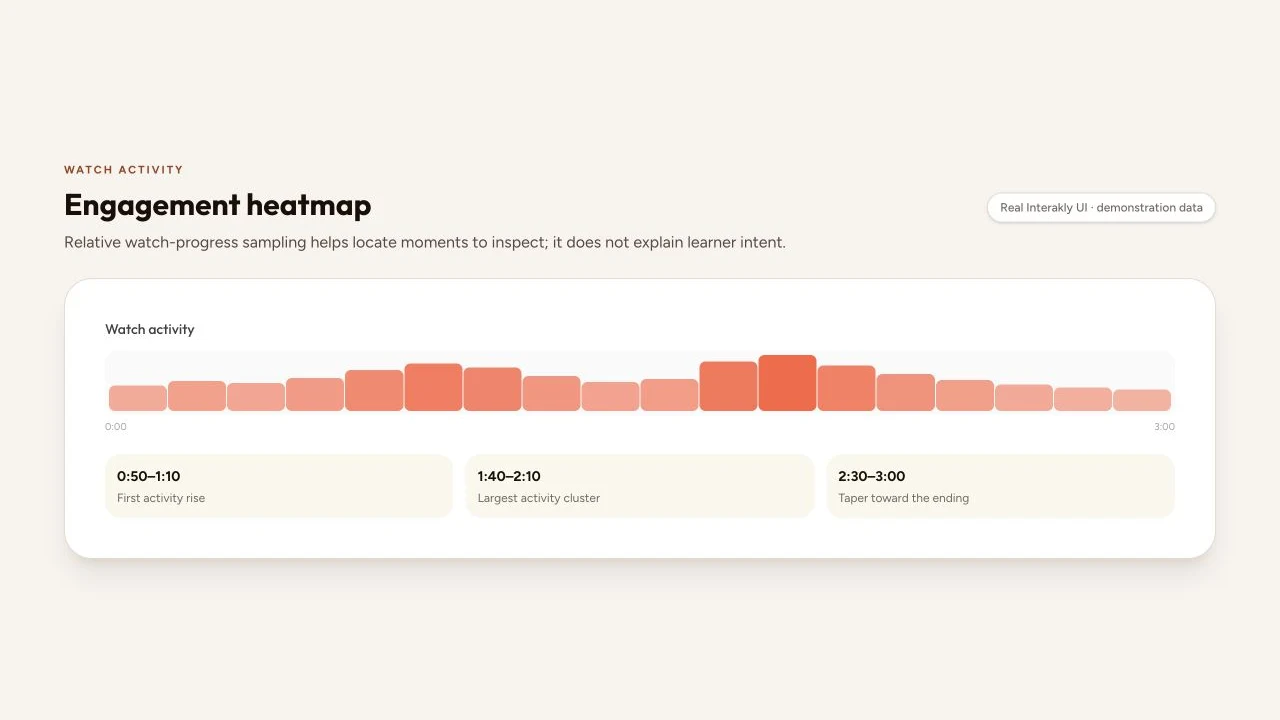
Know what the bars count
Heatmaps with similar colors may use very different inputs. One platform may show the share of unique viewers reaching each second. Another may count playhead events, seeks, or replays. A third may combine several signals into a proprietary score. Never import an interpretation from a different product without checking the calculation.
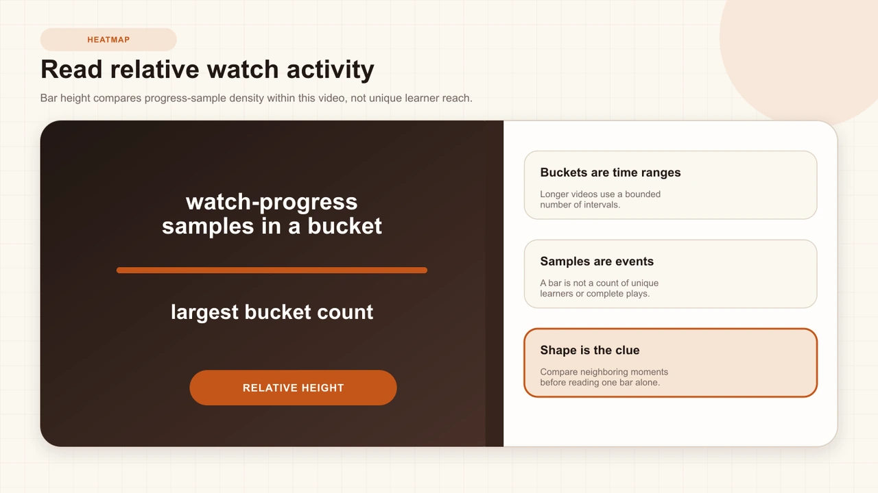
Interakly groups recorded watch-progress events into time buckets. Each bucket stores a count of those samples, and the visible height is scaled relative to the busiest bucket in the current heatmap. The correct tooltip language is therefore “watch-progress samples.” A session can contribute more than one sample, so the count must not be relabeled as people.
Read relative intensity
Relative bars answer an inside-the-video question: which buckets have more or less recorded watch activity than other buckets in this view? The tallest bar establishes the scale. A bar at half height does not necessarily mean half the learners reached that moment, half the watch time occurred there, or half the audience left.
Keep the raw sample count available in a tooltip or export when possible. Two heatmaps can have identical shapes and very different evidence volume. Twenty samples spread across a short pilot and twenty thousand samples from a mature course should not receive the same confidence or reporting language.
Overclaim
The spike proves learners rewatched because this explanation was confusing.
Defensible reading
This interval has relatively more watch-progress samples; inspect replay, seeking, interaction timing, cohort mix, and learner reports.
Avoid the attention fallacy
A playing video does not prove attention, and a paused or replayed video does not prove confusion. Learners can listen while looking elsewhere, replay a valuable example, seek to a known answer, leave a tab running, or pause to take useful notes. Event logs record interactions with a system, not the learner's full cognitive state.
Research on educational video analytics repeatedly treats log patterns as proxies that require contextual interpretation. “Making Sense of Video Analytics” shows the promise of locating behavioral patterns, while also making clear that interpretation depends on the learning design and the questions researchers ask. Use the heatmap to decide where direct evidence would be most valuable.
Interpret common shapes cautiously
Pattern names can speed up a review, provided they remain hypotheses. A cluster around an interaction may reflect a legitimate pause and resume. A rise before a checkpoint may reflect seeking. A taper near the end may reflect the sampling model, a perceived ending, assignment conditions, or actual exits. A flat shape may reflect steady playback or insufficient variation to distinguish behavior.
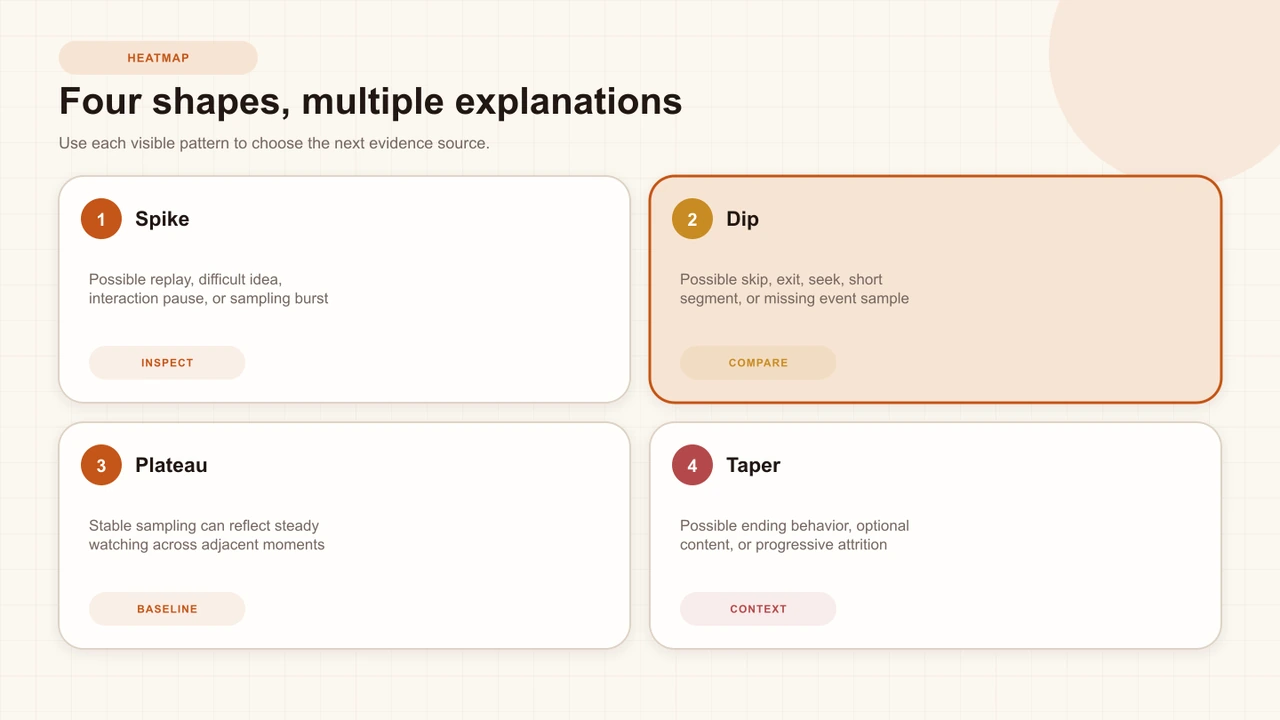
- Localized rise: inspect a nearby question, replay-worthy example, seek target, or source transition.
- Localized dip: inspect segment boundaries, buffering, branching, and whether the bucket was actually eligible for every route.
- Gradual taper: compare completion and assignment context before calling it abandonment.
- Repeated peaks: check authored interactions and chapter boundaries before attributing them to content difficulty.
Inspect time and interaction context
Put the heatmap beside the authored timeline. Mark blocking questions, passive cards, calls to action, chapters, branch transitions, and source changes. An interaction can intentionally pause playback and change the cadence of progress samples. That is not a defect; it is part of the learner journey the chart summarizes.
Replay at least thirty seconds before and after a flagged bucket. Read the transcript, captions, prompt, options, feedback, and resume behavior. Test the published uploaded-video or YouTube lesson in the actual destination, because embed size, source controls, and network behavior can create a pattern the content alone cannot explain.
Triangulate before acting
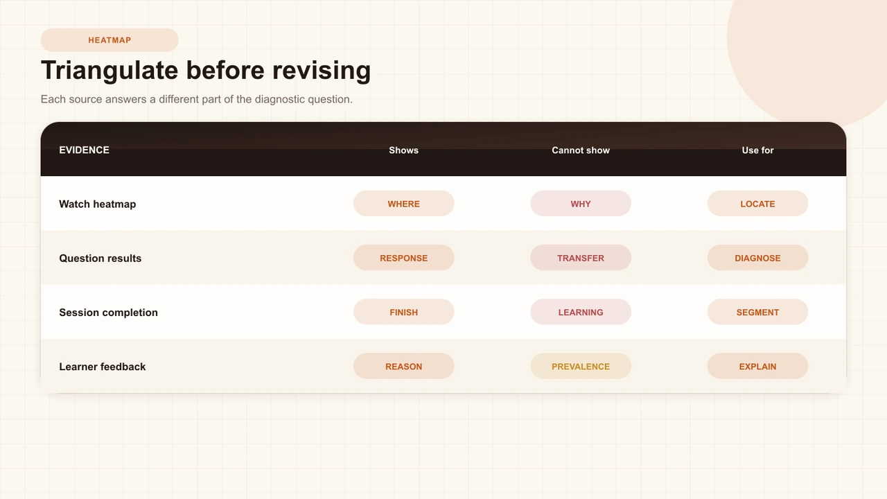
Combine evidence that answers different questions. Question analytics can reveal a concentrated response pattern near the flagged time. Completion can show whether sessions reached the configured boundary. Technical logs can expose source or submission failures. Observation and interviews can explain what learners expected and why they acted.
Locate
Name the exact interval and describe only its relative watch-activity shape.
Map
Overlay interactions, chapters, branches, captions, and source boundaries.
Cross-check
Review question, completion, technical, and qualitative evidence for the same context.
Explain cautiously
Retain competing hypotheses until a direct check separates them.
How to Read Video Question Analytics
Use response counts, graded correctness, and distractor patterns to add outcome context around a heatmap moment.
How to Interpret Interactive-Video Completion Rate
Keep the session boundary, rule, and cohort visible when a heatmap pattern appears near the ending.
Compare cohorts and versions
Compare heatmaps only when their event model and normalization are the same. Keep period, source version, video duration, route availability, audience, assignment conditions, and sample volume beside each view. A relative scale can make two different absolute activity levels look visually identical.
For branching lessons, route eligibility matters. A bucket in one segment may be available only to learners who selected a particular path. Do not compare that bar with a globally available opening as if every session had an equal opportunity to contribute. Analyze route context and response evidence together.
Turn a pattern into an experiment
A heatmap becomes actionable when it produces a falsifiable design question. If a cluster sits around a dense explanation and nearby question performance is weak, hypothesize that the explanation is hard to follow. A competing hypothesis might be that the question wording drives seeking. Change one element and preserve the original evidence.
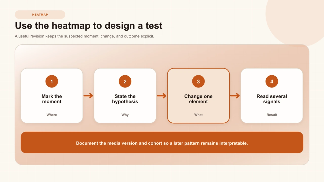
Compare fresh attempts after the documented revision. A changed shape is a changed behavioral pattern, not proof of improved learning. Look for the intended question, performance, or qualitative outcome as well. If the heatmap changes but the learning evidence does not, the intervention may have changed navigation rather than understanding.
Protect privacy and validity
Event data can become sensitive when combined with identity, cohort, or performance. Limit access, publish a clear purpose, use the minimum detail needed for the instructional decision, and avoid exposing small groups. Do not infer an individual's diligence, ability, or motivation from a playhead trail.
Validity concerns the claim you make from the evidence. A chart can be technically accurate while the interpretation is invalid. Jisc recommends transparency about algorithms and responsible interventions. EDUCAUSE's “On Trak” makes the enduring point that analytics can help identify what happened while educators still have to investigate why.
Interakly product boundaries
Interakly's current engagement heatmap buckets watch-progress events and scales each bar against the busiest bucket. Tooltips report watch-progress samples. The surface does not claim unique viewers, exact audience reach, attention, or a direct rewatch count. A no-data state is possible when no eligible watch evidence has been recorded.
Both uploaded-video and YouTube projects can generate playback evidence, but their source behavior and available interaction types differ. For scenario content, segment and route context can affect which moments were available to a session. Always read the heatmap inside the specific project, source, version, and route.
A practical heatmap review
- Write what the event count and bar normalization mean.
- Record the time range, sample volume, period, and project version.
- Describe one visible pattern without explaining it.
- Map the authored timeline and replay the surrounding learner route.
- Check question, completion, technical, route, and qualitative evidence.
- Write at least two plausible explanations.
- Test one bounded revision and evaluate the intended learning outcome separately.
Sources and further reading
- ERIC: Making Sense of Video Analytics — interpreting educational video behavior in learning context.
- EDUCAUSE: On Trak—First Steps in Learning Analytics — the difference between identifying what happened and explaining why.
- EDUCAUSE: Data-Informed Learning Environments — combining analytics with instructional judgment.
- EDUCAUSE: The Two Worlds of Learning Analytics — connecting research and operational practice.
- Jisc: Code of Practice for Learning Analytics — transparency, validity, access, and responsible intervention.
- IES: Using Student Achievement Data to Support Instructional Decision Making — a disciplined evidence-to-action cycle.
- American Statistical Association: Statement on P-Values — caution against unsupported causal and practical claims.
FAQ
What does a video engagement heatmap show?
It shows the relative activity recorded for time buckets under a product's defined event model. You must inspect that model before calling a bar viewers, reach, rewatching, attention, or drop-off.
Does a tall heatmap bar mean learners were highly engaged?
Not necessarily. A tall bar means more recorded activity under that heatmap's calculation. It may reflect replay, seeking, a larger active cohort, an interaction, or technical sampling—not motivation or understanding by itself.
Can a heatmap identify the exact place learners stopped watching?
Only if the underlying metric explicitly measures exits or audience reach. Interakly's current bars summarize watch-progress samples by time bucket, so they should be used to locate moments for inspection rather than labeled as unique-viewer drop-off.
How should I investigate a spike?
Replay the moment, check nearby interactions and source behavior, compare response and completion evidence, review technical events, and ask learners what they were doing. Keep several explanations open until evidence separates them.
Can I compare heatmaps from two videos?
Compare only when the event model, bucket method, audience, time window, source conditions, and purpose are sufficiently similar. Relative bar height inside one video is not automatically comparable with another video's scale.
Can a heatmap prove that an edit improved learning?
No. It can show a changed behavioral pattern. Learning improvement requires outcome evidence and a comparison design that addresses other plausible causes of the change.
Interactive Video Best Practices
Design outcomes, timing, feedback, mobile composition, accessibility, and analytics as one coherent learner experience.
Use the heatmap as a locator
Choose one interval, write two competing explanations, and gather the next piece of evidence before changing the lesson.
Explore video interactions