Designing Interactive Video for Mobile Learners
Design phone-friendly interactive video with uniform composition scaling, clear touch targets, protected controls, usable text entry, and real-device QA.
Mobile interactive video is a player-design problem inside a responsive page. The learner may see a 16:9 player only a few hundred physical pixels wide, a portrait video inside a landscape iframe, or a short-height fullscreen view with browser controls nearby. The interaction still needs to preserve its hierarchy, operate by touch and keyboard, and remain inside the player.
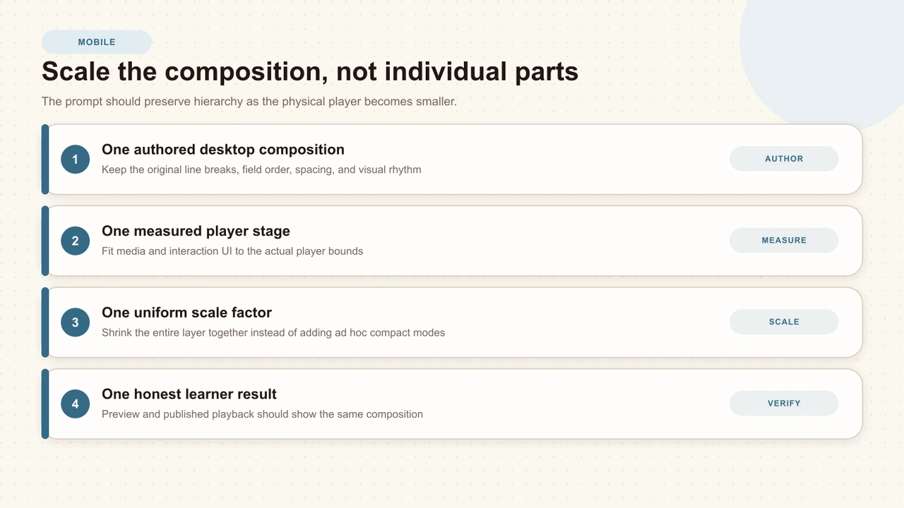
The strongest approach is one authored composition, one measured stage, and one uniform scale. Avoid a collection of child-specific compact modes that rearrange the task differently at each breakpoint.
Design the player, not just the page
A page can reflow correctly while the embedded player remains unusable. Test the physical dimensions of the player in the learner destination. A 900-pixel-wide preview says little about a 393-pixel phone browser with page margins and browser chrome.
List the smallest maintained player, common LMS column, portrait source, landscape source, and fullscreen state before authoring. Use those states as release targets rather than discovering them after publication.
Preserve one authored composition
Author the interaction once at a stable desktop reference size. When the player becomes smaller, scale the entire interaction layer: prompt, answer cards, text, controls, spacing, icons, and feedback. This preserves the exact relationships the creator approved.
Breakpoint redesign
The phone version changes card widths, stacks options, hides supporting copy, and enlarges one control independently.
Uniform composition
The complete approved hierarchy shrinks with one parent transform while media and player controls keep their own geometry.
Keep the video aspect correct
Media aspect and interaction workspace are separate. Preserve the source ratio for 16:9, 9:16, square, 4:3, and custom video rather than stretching every source into a standard rectangle. Fit the source against the available width and height; use intentional letterboxing when the stage and source differ.
Spatial interactions must follow the measured media canvas. A hotspot at the turtle's head cannot use the outer player bounds when portrait gutters or letterboxing change the visible media area. Non-spatial blocking prompts can use a separate player-owned workspace without changing hotspot coordinates.
Give every player zone one owner
The media canvas, interaction workspace, caption band, transport, and host page have different responsibilities. Define those boundaries explicitly so a backdrop does not cover the timeline, a caption does not collide with feedback, and an iframe interaction does not escape into the page.
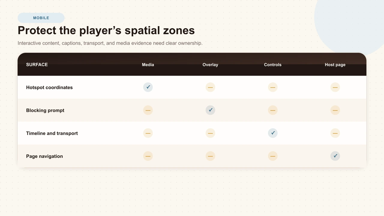
- Media canvas: video pixels, hotspots, spatial labels, and other source-relative geometry.
- Overlay workspace: non-spatial blocking prompts, result detail, access gates, and supporting surfaces.
- Caption band: the measured bottom area currently occupied by wrapped captions.
- Controls: timeline, markers, transport, caption toggle, speed, volume, and fullscreen.
- Host page: page navigation, comments, sharing, and unrelated content outside the player.
Make touch targets forgiving
Target size is a combination of the visible object, its actual hit area, spacing, and the consequence of a mistake. WCAG 2.2 defines a 24 by 24 CSS pixel minimum with exceptions. Apple recommends 44 by 44 points for ordinary iOS and iPadOS controls. Use the applicable minimum as a floor, then make frequent or high-consequence controls larger.
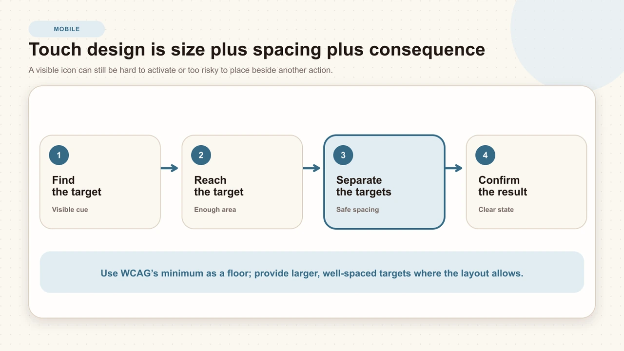
- Keep timeline endpoints and clustered markers inside the player shell.
- Separate destructive, submit, close, and playback actions.
- Do not make the visual icon larger while leaving the hit target tiny.
- Use one-tap alternatives for multipoint or path-based gestures.
- Confirm selection immediately with fill, icon, text, or another redundant cue.
Interactive Video Accessibility
Review target size together with captions, keyboard operation, timing, state clarity, spatial alternatives, and recovery.
Keep text entry usable
A scaled input may look correct and still fail when iOS opens the software keyboard. The initiating tap must keep ownership long enough to focus the field; the keyboard should not hide the value or action; and tapping inside the player should not resume playback behind the form.
Tap the real field
Use the published player on a touch device and confirm the same gesture focuses the field and opens the keyboard.
Type and correct
Enter a long response, move the caret, select text, use autocorrect, and verify the value remains synchronized with the authored control.
Reach the action
Keep submit, cancel, validation, and supporting instructions visible or scrollable inside the player-owned task.
Close and resume
Dismiss the keyboard, submit, read feedback, and confirm the player resumes only after the learner's explicit action.
Design for short height and orientation
Landscape phones, split-screen windows, and browser chrome can leave less vertical space than expected. Keep the interaction within the player and use one bounded internal scroll path only when the complete authored content genuinely exceeds the controls-cleared workspace.
Do not lock orientation unless a specific presentation is essential. Rotate between portrait and landscape, then check the currently focused control, caption band, prompt scroll position, and transport. A layout that survives initial load may still break during rotation.
Respect embeds and fullscreen
An iframe has fixed outer bounds controlled by the host. Fit every source inside those bounds and contain prompts, backdrops, lightboxes, menus, feedback, and celebrations inside the interactive shell. Do not label a fixed-position takeover as fullscreen when the browser cannot promote the complete shell beyond the iframe.
True element fullscreen should enlarge the same experience, not swap in a new mobile or desktop variant. Re-measure the stage, keep the media aspect, scale the interaction once, and preserve focus and open-state ownership.
Place interactions at stable moments
Mobile learners have less visual context and may be watching in a noisy or interrupted environment. Place blocking questions after the speaker and caption complete the relevant idea. Avoid opening a prompt during fast motion, while a demonstrated control is still changing, or just before a segment transition.
- Use a stable frame when the question depends on visual evidence.
- Leave enough time for a wrapped caption to be read before pausing.
- Space blocking prompts so the learner can reorient to the video.
- Keep passive cards away from the essential action and caption band.
- Test seeking across a due moment and natural playback at faster speeds.
Run the mobile test matrix
Test the public learner route with realistic content: long prompt, long option, two-line caption, feedback, text entry, clustered timeline moment, and a source with a non-16:9 aspect. A blank component fixture cannot expose the full composition risk.
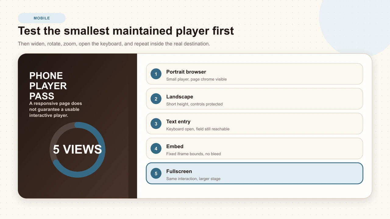
- Portrait browser: use the smallest maintained player with the surrounding page visible.
- Landscape: check short-height containment, captions, and controls.
- Text entry: open the software keyboard and complete validation and submission.
- Embed: use a realistic narrow host column and confirm no layer escapes its iframe.
- Fullscreen: promote the complete shell and confirm the interaction remains the same composition.
Interakly mobile behavior
Interakly's uploaded-video player preserves source aspect and uses a shared virtual stage for learner interactions and editor preview. The desktop interaction is uniformly reduced with the physical player rather than receiving child-specific phone layouts. Spatial content remains bound to the measured media canvas, while non-spatial prompt surfaces can use the player-owned overlay workspace.
Uploaded video enables frame-relative interactions and complete segment-based branching. YouTube supports non-spatial overlays through its embedded source. In both cases, test the public route; a wide creator canvas is not the release surface.
Sources and further reading
- W3C WAI: Understanding Reflow — responsive access at a width equivalent to 320 CSS pixels.
- W3C WAI: Understanding Orientation — avoiding unnecessary portrait or landscape restrictions.
- W3C WAI: Understanding Target Size (Minimum) — the 24 by 24 CSS pixel criterion and its exceptions.
- W3C WAI: Understanding Pointer Gestures — single-pointer alternatives for multipoint and path-based gestures.
- W3C WAI: Understanding Focus Not Obscured — keeping focused fields and controls visible.
- Apple Human Interface Guidelines: Accessibility — platform recommendations for legibility, control size, gestures, and alternatives.
FAQ
Should mobile interactive video use a compact version of each question?
Not by default. Preserve one authored interaction hierarchy and scale the complete composition with the player. A separate compact mode often changes line breaks, order, spacing, and meaning between preview and published playback.
What is a good touch target size for video controls?
WCAG 2.2 sets a 24 by 24 CSS pixel minimum with defined exceptions. Platform guidance often recommends larger controls; Apple, for example, recommends 44 by 44 points for ordinary controls. Use the minimum as a floor and provide larger, well-spaced targets when possible.
How should a portrait video appear on a phone?
Preserve the source aspect instead of stretching or cropping it into 16:9. Fit the media within the available stage, keep spatial interactions on the measured media canvas, and let non-spatial prompts use the player-owned overlay workspace.
Why does a mobile interaction look different from the editor preview?
The preview may be using a wide authoring canvas while the learner sees a small player or fixed iframe. Test the same rendering authority in editor preview and public playback, with one measured scale factor and the same saved geometry.
How do you test text input inside a small video player?
Use a real touch device or mobile browser, tap the field, open the software keyboard, type and correct text, submit, close the keyboard, and verify that playback does not steal the initiating tap or hide the field and action.
Which mobile views should be in release QA?
Test a phone portrait browser, phone landscape, text entry with the software keyboard open, a fixed-size embed, and true fullscreen. Include portrait media and the smallest maintained player size used by the product.
Captions for Learning Videos
Keep caption timing, wrapping, and placement clear inside small interactive players.
Keyboard-Accessible Video Interactions
Test focus, controls, dialogs, timeline moments, and recovery alongside the touch route.
Interactive Video Best Practices
Connect mobile composition to outcomes, source choice, timing, feedback, analytics, and release review.
Test the smallest real player first
Use the complete published lesson on a phone, then rotate, open the keyboard, embed it, and enter fullscreen without changing the authored composition.
Explore video interactions